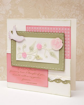
"I love the beautiful, professional look embossing brings to any project, and today's 'reverse' emboss, also known as an 'emboss resist' is a longtime favorite. Start with a color palette you love—I've chosen sweet spring tones of Amethyst, Blush, Garden Green, and Pansy Purple. Then, turn to your Versamark ink pad and clear detail embossing powder and get ready to make some watercolor-like magic!

When used on light paper, the outline appears light with soft color surrounding it. When used on darker papers, you get a soft muted contrast with deeper tones." Jeanette Lynton
Jeanette's blog has detailed steps to create the embossed resist effect. She also shares a gorgeous 2-page 12"x12" layout and an additional card that features this embossing technique.
No comments:
Post a Comment